THE DETAILS
Branding, Brand Kit, Strategy
THE CHALLENGE
Brand Identity for Downtown Attleboro, Massachusetts
Downtown Attleboro—just 20 minutes north of Providence—has seen better days. The jewelery capital of the world, the city’s center hosted major gold and silver operations that anchored a bustling district of industry, shopping, and entertainment. As the jewelry facilities moved out of the center, so did much of the life and vibrancy. But recently, investment in infrastructure, arts, and new business is starting to change that. To reflect the bright future the downtown is headed for, HUB worked with the City to create a brand that would communicate all the qualities that make downtown great already and a central focus for the city’s future.
To start, HUB visited downtown to understand the experience of being there. It’s not your typical central business district: most either unfold along a single Main St or focus around several regularly spaced blocks. Attleboro’s downtown is more of a spider web of crossings, intersections, and surprising alleyways that conceal the extent of its boundary and can trick visitors into thinking there’s less to do than there really is.
We also hosted extensive interviews and workshops with the public, city officials, developers, and community leaders to better understand what downtown means to each group and what people aspire to see happening there.
We then sorted through everything we saw and heard to discover what a brand really needed to convey about Downtown. Two things became paramount: honor the city’s jewelry heritage without getting stuck in the past, and celebrate the districts web-like layout as an asset rather than a detriment. From here, we explored several visual concepts, including the mosaic, intersection, industrial heritage, and the concept of windows to stories. We developed numerous logo sketches based on these ideas before narrowing down to a handful of logo ideas to explore further. Two of these concepts went before a public meeting where a final logo was selected.
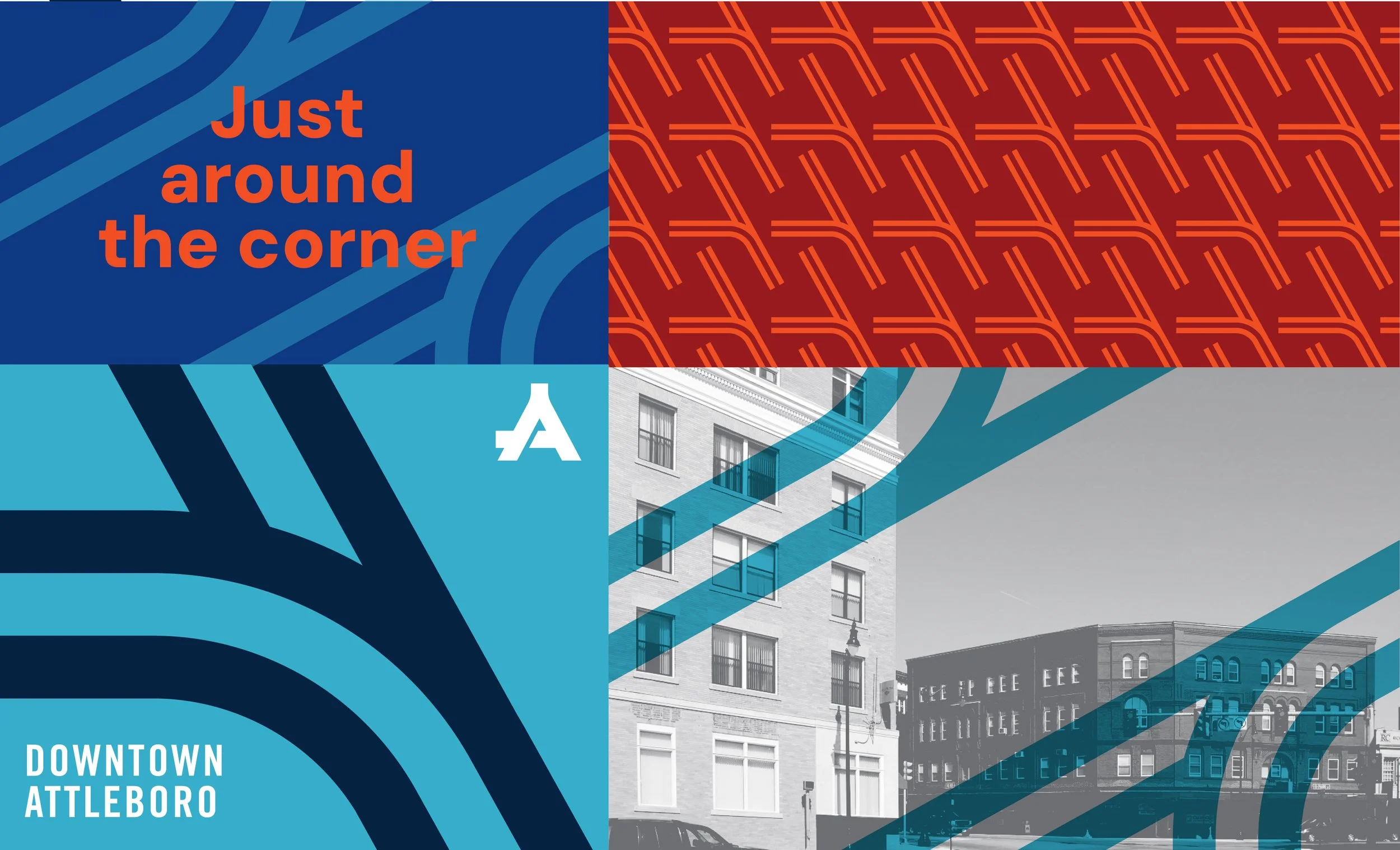
The chosen direction, inspired by Attleboro’s heritage as the “Jewelry Capitol,” consists of a class ring signet which is combined with an A monogram that represents the crossroads of Downtown Attleboro. A rich, jewel-tone color palette further nods to the downtown’s central role in jewelry manufacturing.
The tagline celebrates that Downtown Attleboro is a little different than other downtowns that unfold along a central, main street. Downtown Attleboro is a connected network of streets, where no single block or throughway claims the title of most important. This means visitors have lots of pathways to explore. As they turn a corner, they are filled with delight and surprise of finding something new on a street that was previously out of sight.
With this continuous network, visitors can move from one street to the next, always tempted by what’s just around the corner.
Brand Kit
The city is now using the full brand toolkit to implement new wayfinding signage throughout downtown, alongside other initiatives to build pride and excitement in the bright future downtown holds.


