THE CHALLENGE
How do you differentiate in a saturated market?
Simple ingredients, beautiful branding
Camellia Grove Kombucha was made to bring joy to the everyday while enhancing mental and physical well-being. The ingredients are simply tea, sugar, and filtered water; that’s it. So it’s only fitting that we create a straightforward and approachable kombucha brand for people who are intentional about their health choices and aware of their impact - while taking joy in the little things in life.
Combing the kombucha market
With light market research and competitor analysis in hand we worked with our client to better understand both savvy and newcomer kombucha drinkers to develop a target persona and demographic for the brand. We also worked together to lay a brand foundation built upon the product purpose, audience, and business goals. A brand story, tone, and visual inspiration sprouted naturally from these insights.
Balanced Joy Seeker
Our target persona is career-focused but also wants to enjoy life. She is intentional about her health choices and is a savvy consumer aware of her impact. She owns a mix of used and new things, but she splurges on herself for well-being — for example on yoga retreats and wine club memberships. She is intentional about taking care of herself and carving time out to recharge. She is a casual yoga go-er and bike commuter, appreciates the outdoors but lives in an urban environment. In her free time, she volunteers with her community and spends time with friends and her significant other and enjoys eating good food with friends in Portland’s foodie scene. She strives for vitality through eating whole foods and healthy beverages, but also nourishes her soul with her favorite treats that add joyful pep to her day. She embraces imperfection—both in herself and in life. She doesn’t take life too seriously, but appreciates the things and experiences that help her to feel and be her best.
Flowers with flavor
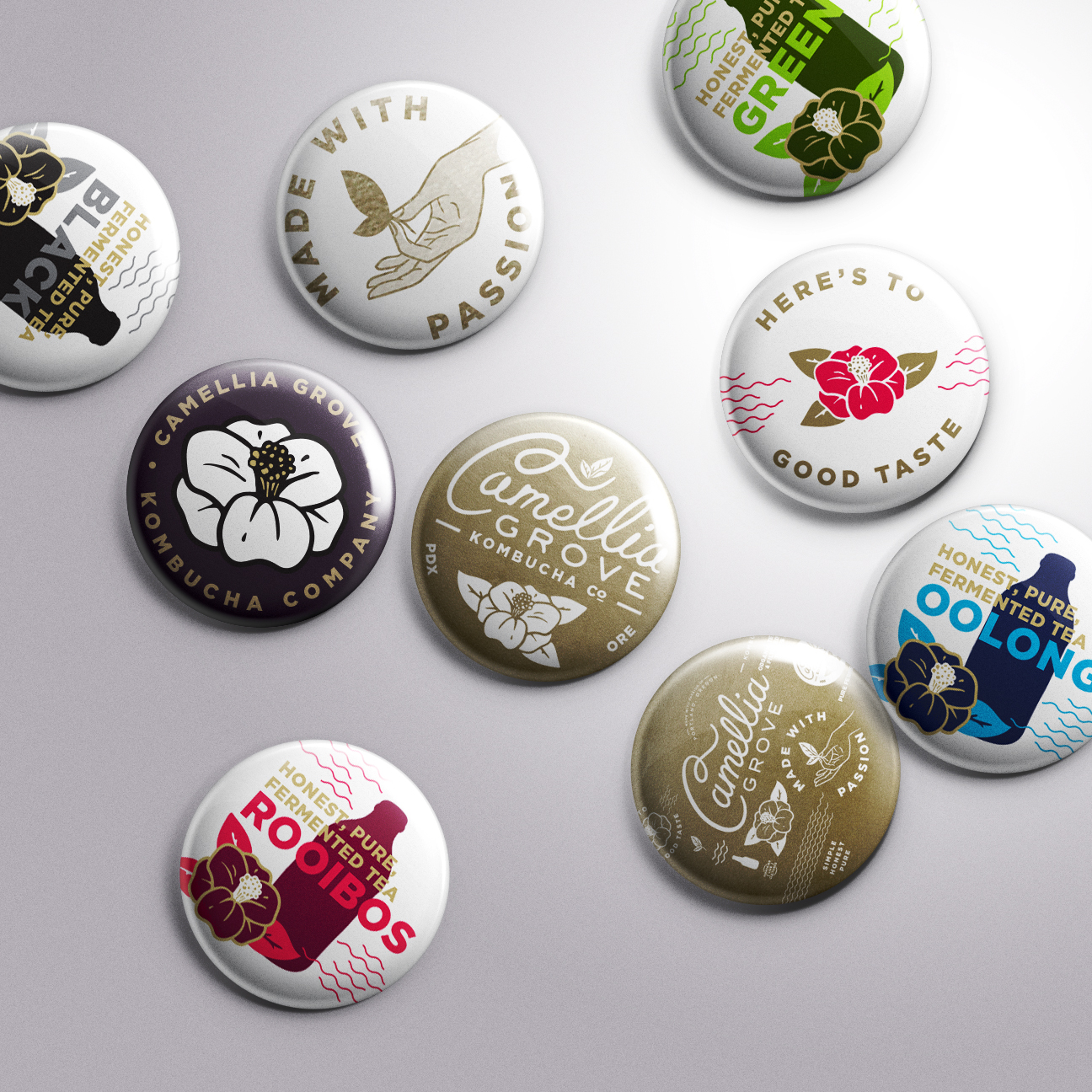
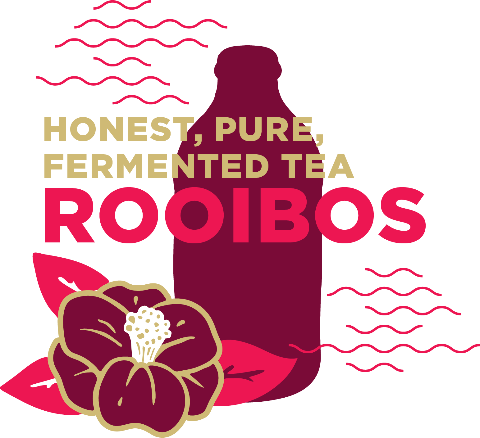
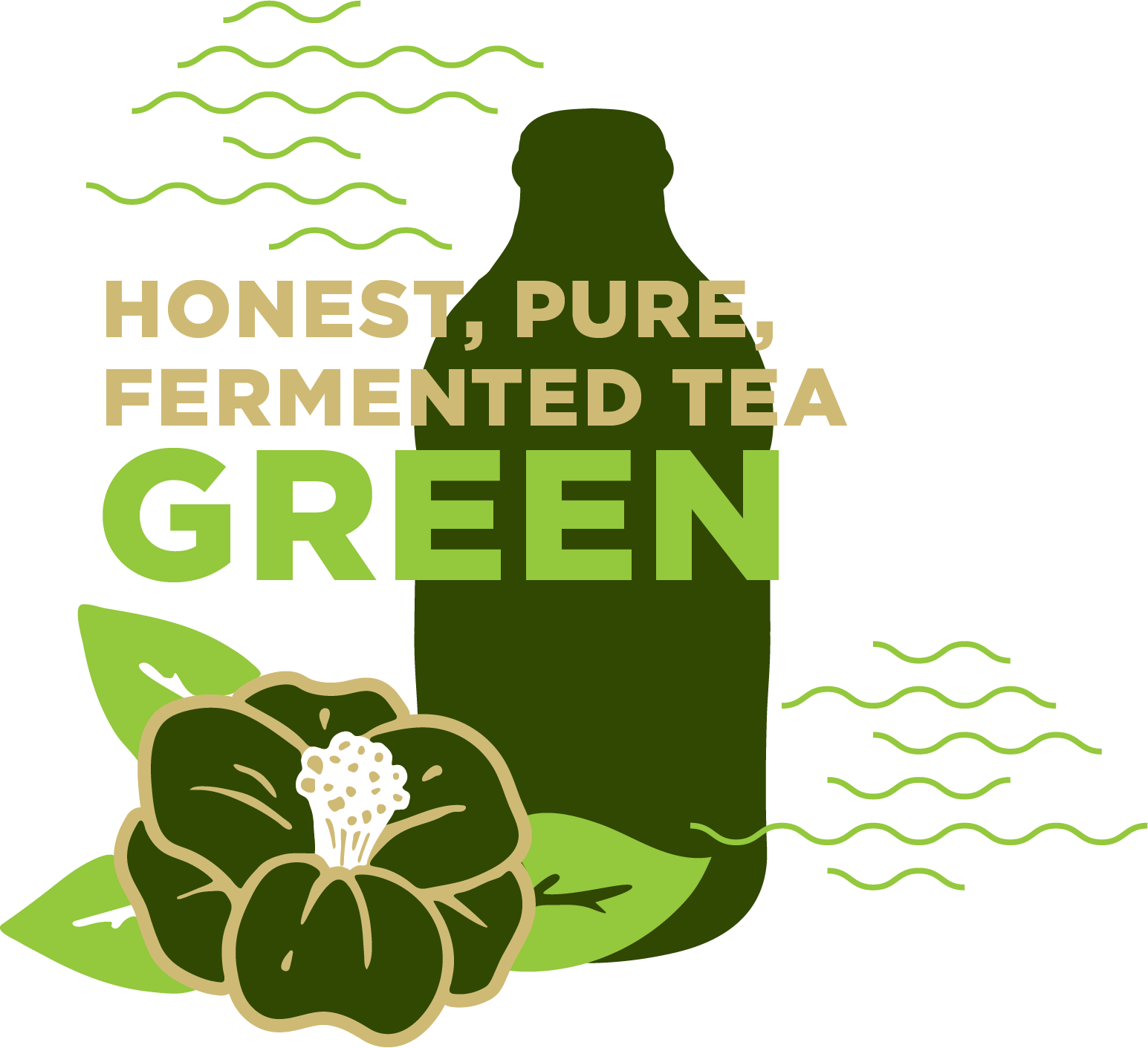
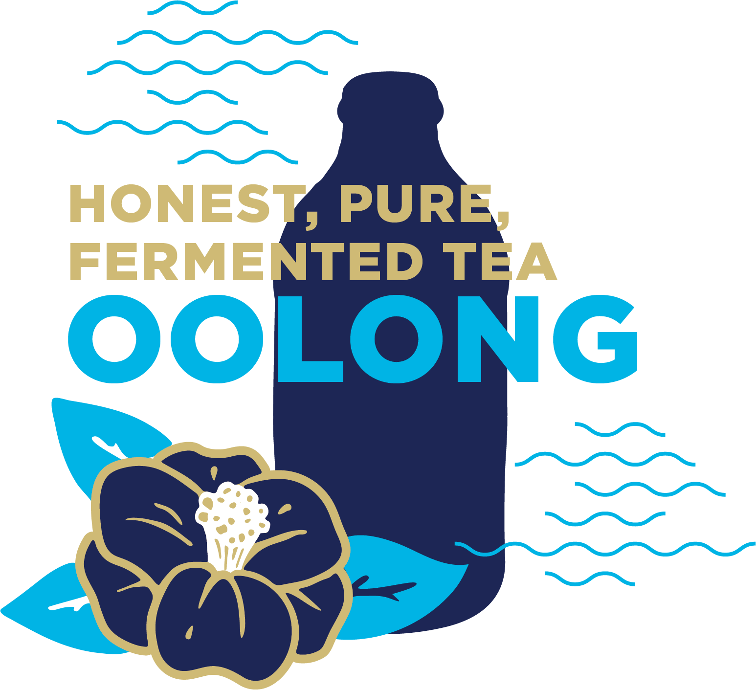
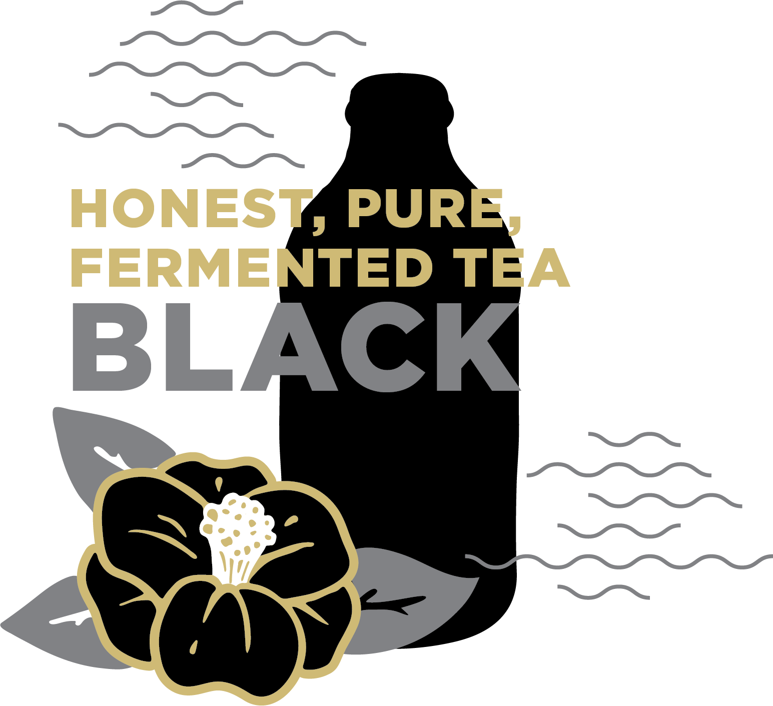
Building from the beauty and story of the Camellia tea flower we developed a clean and simple yet sophisticated brand and label suite to embody the essence of this craft beverage and appeal to the balanced joy-seeker.With a fresh white label and metallic gold inks we let the brand and flavor shine while standing out on shelf from the busier competitor brands. The color pop on the camellia flower accentuates the flavor system while supporting icons and copy help expand on the Brand Story. Here’s to good taste!
DETAILS
Designed in Partnership with Camellia Grove
Brand Strategy, Communications, Marketing, Design


